Yes, You Need a Style Guide
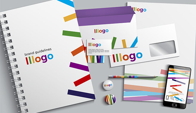
Sometimes known as graphic standards or brand guidelines, a style guide is essential to keeping your brand identity consistent. Every brand, from the smallest startup to the biggest industry leader needs a set of branding guidelines and rules to maintain its identity and control what the public sees.
Referred to in the marketing department as "The Brand Bible,” this manual establishes the voice and governs communication of a company.
Start With The 3 Basics
1. Logo
Remember that the purpose of a style guide is to establish and enforce style to improve communication. There is no better place to start than the logo. A professional looking, well designed logo builds trust. Establish the following guidelines for your logo:
- Show all variations of the logo and where they should and should not be used
- List rules regarding modifying the logo and what shouldn’t ever be done
- Describe and show proper placement and spacing of the logo
- Explain and show examples of how the logo should and should not appear in different scenarios and backgrounds
Although you may think this level of documentation is overkill for small businesses, you couldn’t be more wrong. Inconsistent use of your brand's logo can hurt your business and confuse your audience. Remember, your logo is the simplest thing people have to identify your brand… so why take chances?
2. Fonts
It is important to present a consistent visual identity across as many mediums as possible, so make sure you use a font family or two, exclusively. These fonts should have a defined style for every use, for both print and digital applications.
A bigger brand may have three or four typefaces, but I suggest keeping it simple by selecting two; maybe a serif and a sans serif typeface. However, make sure the typefaces have some common links. Your manual should include one set of rules for print projects and another for digital applications. For example, body text for web commonly uses a sans serif typeface, whereas you may prefer a serif style for print.
3. Colors
Everyone loves color, right? Selecting a few colors that best represent and compliment your industry, audience, and brand message seems easy. However, this may be the trickiest and most broken set of rules you will encounter. A defined set of colors or a color palette is one of the most important aspects of your style guide and the rules should outline each color and how it should be used. This includes colors that appear only in a logo, as well as colors that are used for backgrounds, text and other design elements.
Choose primary, secondary and maybe even a tertiary set of colors for your palette. From CMYK and PMS for print to RGB and HEX for web and digital projects, your style guide should clearly define each color by name and color value for a variety of projects. Keep it simple by limiting your number of colors and tints to a minimum.
Grow Your Guide
As your company grows, so does your communication efforts and style guide. More than colors and fonts, your guide will need to address several marketing disciplines.
Here are a few things you can add as your branding needs grow:
- Letterhead and business card design
- Image use specifications, including photography style
- Writing style and voice
- Social media guidelines
From social media and advertising to logo usage and color palettes, a style guide defines the guidelines for maintaining a brand’s identity, so it’s very important to spend the time and resources to get it right. The ultimate goal is to create a consistent and unified brand presence.
Want More?
If you liked what you read, then you may also like these.